Qareeb
Client
Invisible BoxChronologie
2 WeeksService
Rebranding Logo Design SaaS Symbol System Visual GuidelinesProject
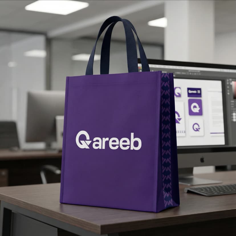
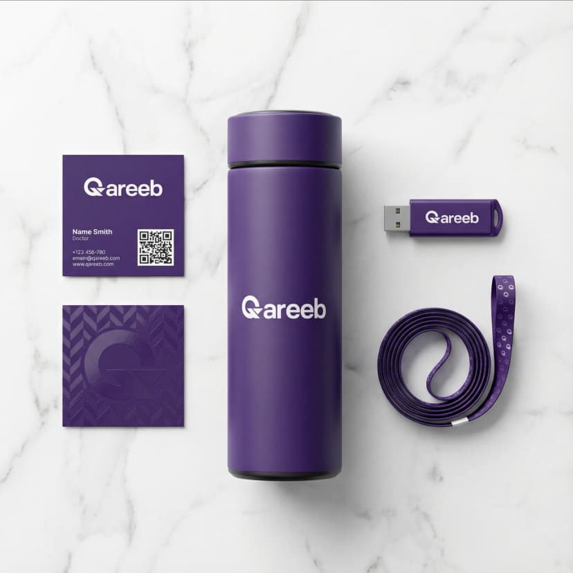
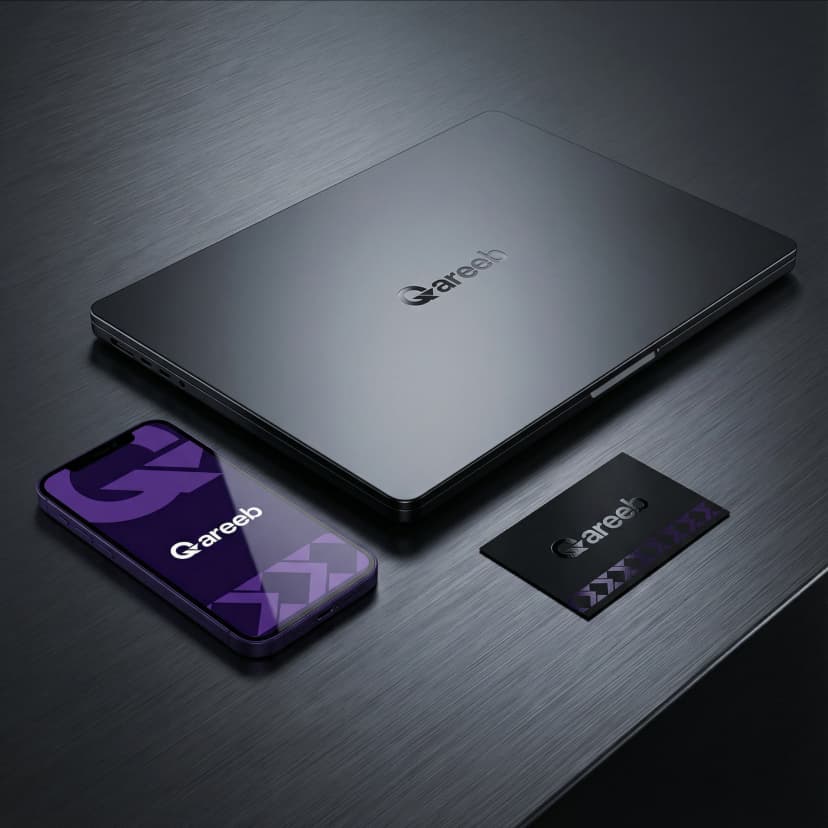
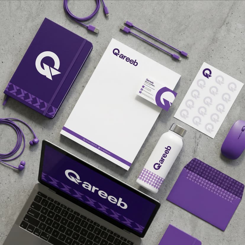
Qareeb
Project summary
Qareeb is more than just a name — it is a symbol of proximity, performance, and precision. Our mission was to translate the technical depth of a software solutions provider into a modern, minimalist, and meaning-rich brand identity.
A logo built with purpose
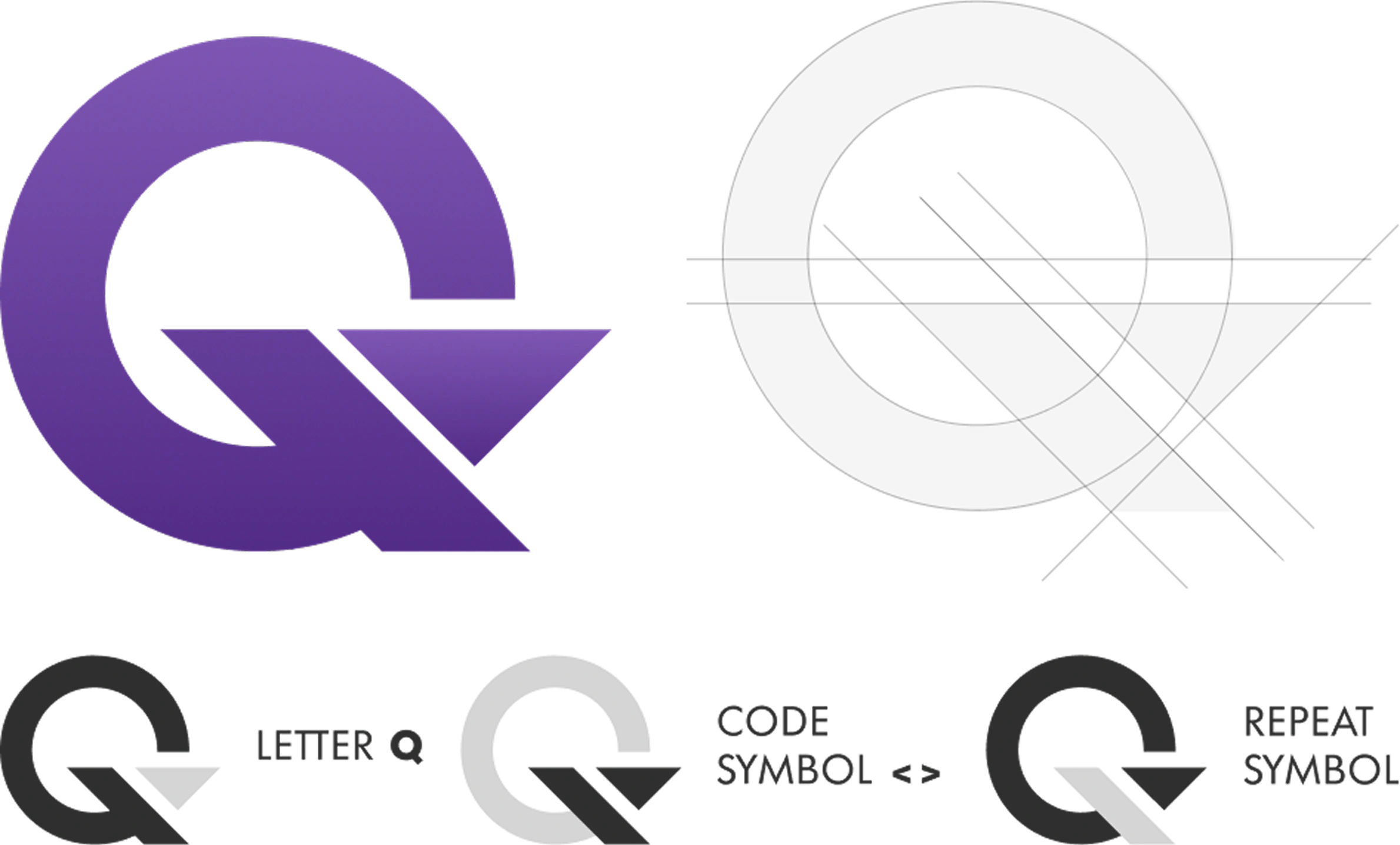
At the core of Qareeb’s identity is the letter Q, integrated with coding and iteration symbols. Every visual element serves a function: Q = Brand initial < > = Digital precision / Code ↻ = Continuous improvement The structure reflects clarity, control, and a high-tech mindset — ideal for a digital partner delivering AI-powered software solutions.
Trust through innovation
We designed Qareeb’s communication strategy to speak directly to fast-growing tech companies. Using bold typography and strong headlines, we introduced key value propositions such as: Smart monitoring Tool integration Scalability This approach not only reflects the product’s capabilities but elevates the company’s image to that of a partner — not just a service provider.