North_Global
Client
Invisible BoxChronologie
2 WeeksService
Brand Identity Logo Design Symbol System UI/UX DesignProject
North_Global
Project summary
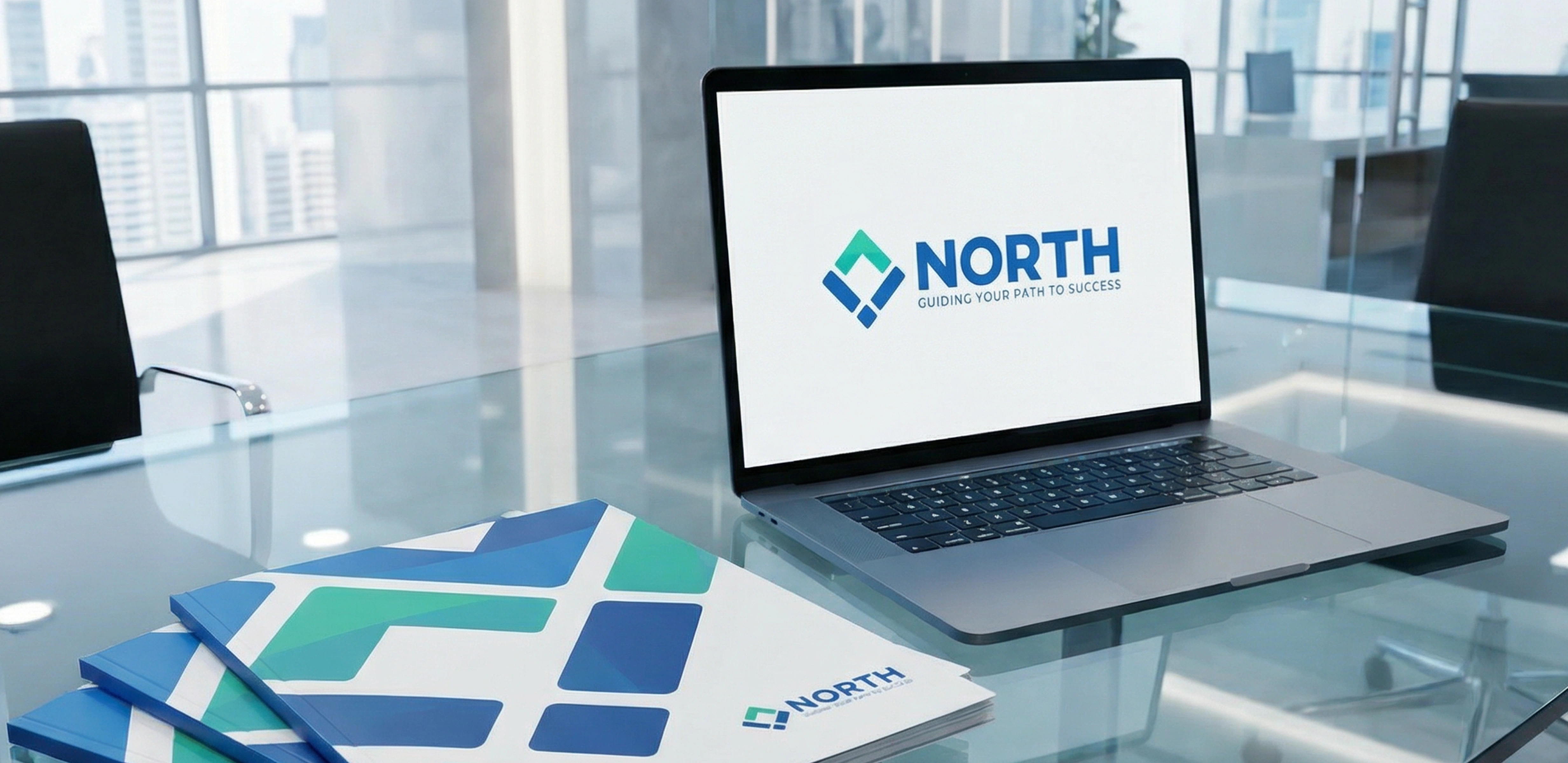
North Global is built around direction, clarity, and strategic growth. The brand was designed to reflect stability, exploration, and confident leadership in a professional corporate context.
A logo built with purpose
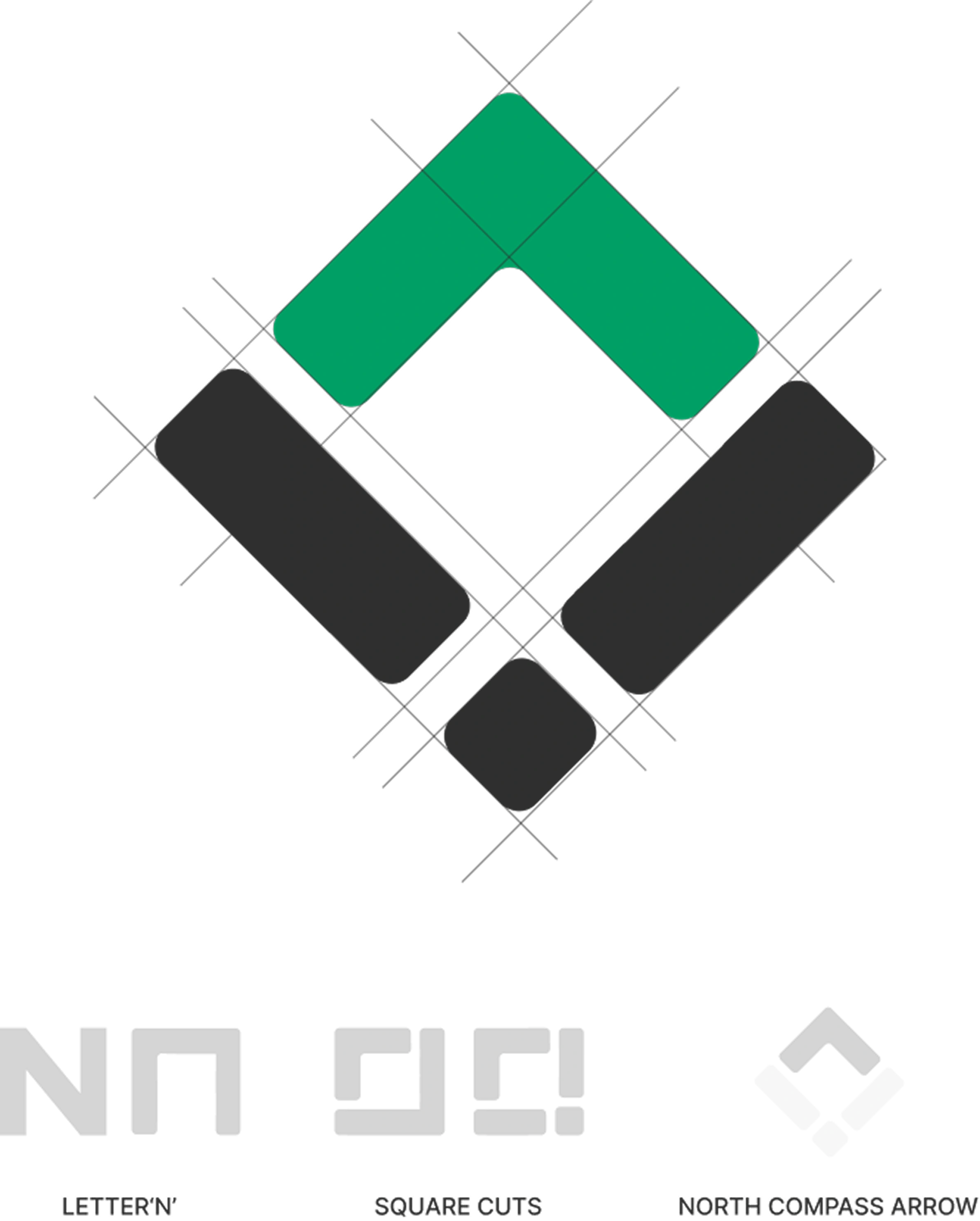
The logo concept combines elements that represent direction, orientation, exploration, and stability. N = Brand initial & strategic direction Arrow = Forward movement & business growth Compass shape = Orientation, vision, exploration Square form = Stability, structure, trust The system merges symbolism and structure into a confident corporate identity.
Trust through innovation
The brand identity speaks to visionary decision-makers seeking clarity and confidence. We extended the identity into the platform’s UI/UX, ensuring the same level of structure, ease, and trust throughout the digital experience.